
Did you like the article? Share it!
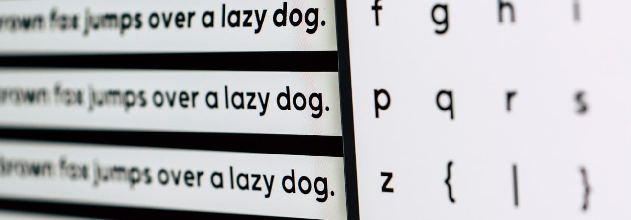
What happens when a potential customer cannot easily ready a label? Probably, being unable to get the information they need, they will opt for another product. A difficult to read text is not only unpleasant to see but it can really make the – negative – difference in terms of sales. Here’s a list of five easy to read fonts to use every time you want to be sure the message will be easily understood.
When you need to write lot of information in a relatively small space like the one of sticker labels, you must be sure that every part of the text is perfectly readable. To do that, one should pay careful attention to some aspects: opt for dark colors on clear backgrounds, choose coated papers and – of course – using an easy to read font.
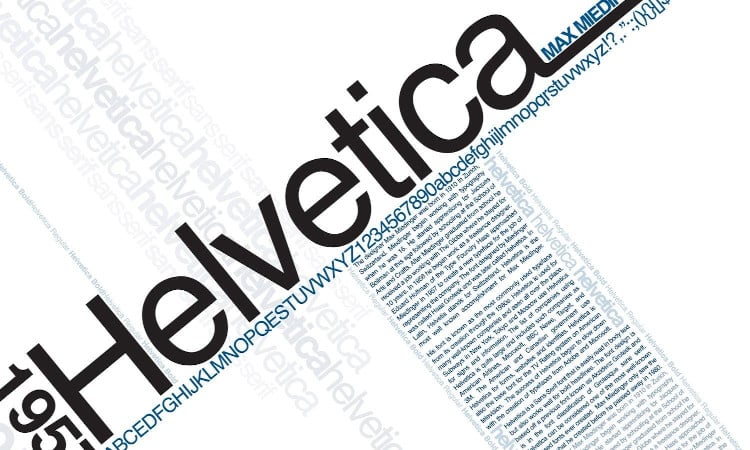
1. Helvetica
As we have already seen before, Helvetica (inserire link: https://www.labelado.com/en/blog/font-color/helvetica-font/) is one of the best font to use when looking for simplicity and clearness. Born in Switzerland at the end of the ‘50s, this font is characterized by the presence of a negative space around letters that is equal to those of lines surrounding every type. This makes the text clear and smooth even when font size is small.
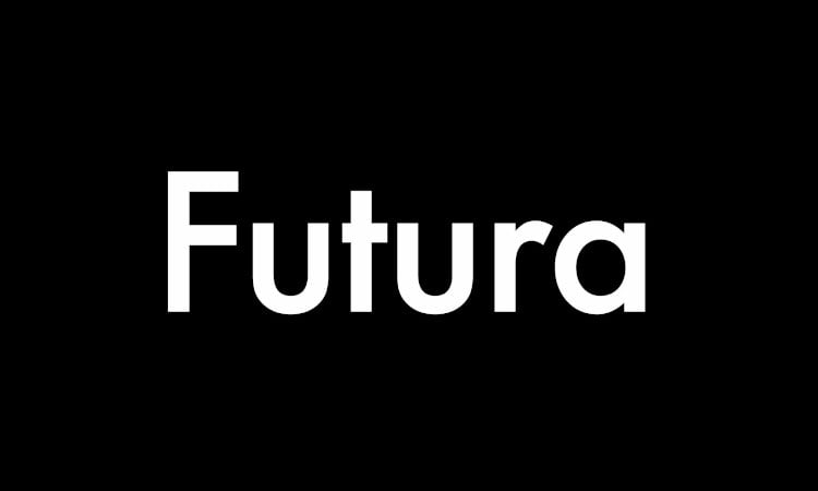
2. Futura
Futura is a sans serif font, geometric, harmonious and linear. Born in Germany in the middle of the ‘20s and strongly influenced by the Bauhaus aesthetic theories, Futura is said to be the first among geometric sans serif fonts: every letter is indeed built on the three easiest shapes – that is, triangle, square and circle. These features makes it the perfect choice when looking for an easy to read font both at really big size (it’s not a case if it’s used by the Italian railways) or really small.
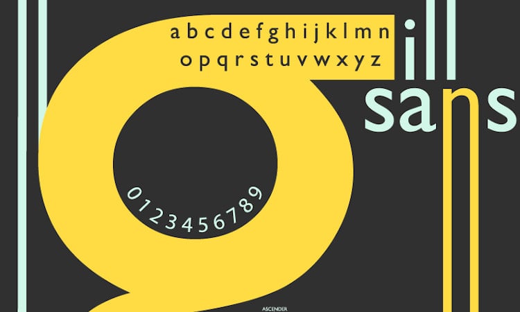
3. Gill Sans
Gill Sans is a sans serif font that combines the elementary geometry typical of modernist typography with the vivacity of handwriting, inspired by roman classical letters. These features earned it the definition “humanistic”, a term indicating all similar fonts from that point on. This easy to ready font, with a fierce and decorous aspect, has been used for hundreds of famous brands and is still today one of the most appreciated.
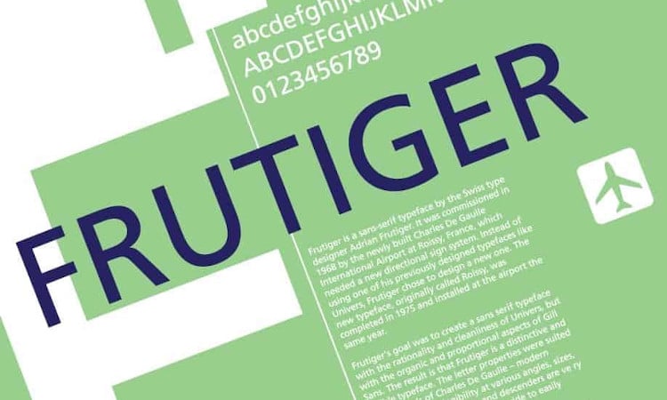
4. Frutiger
Frutiger font has the name of the designer who created it in 1968 for the signage of the Charles De Gaulle airport in Paris. His aim was to create a sans serif font with the same rationality and cleanliness of Universe but with the compactness and immediate recognizability of Gill Sans. The result is a neat, recognizable, clean fonts – the reason why it has been one of the most used fonts in advertising and print over the last 50 years.
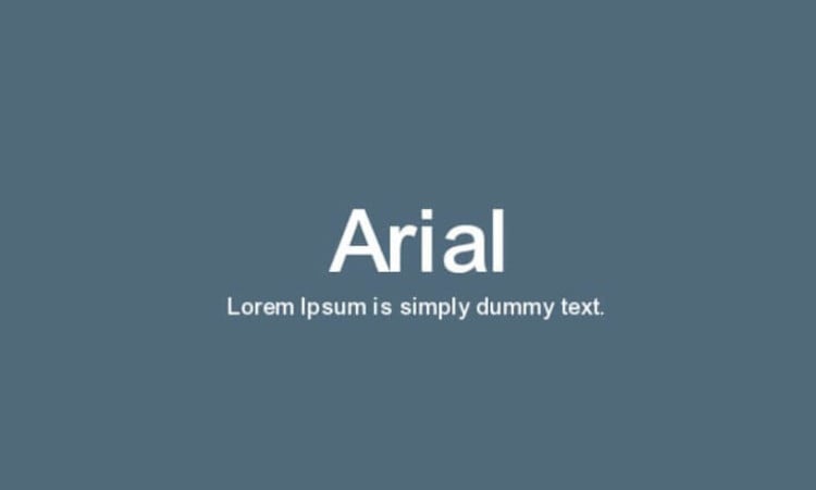
5. Arial
Arial is a typeface made famous by Microsoft but invented for IBM printers at the beginning of the ‘80s. Even if it is often said to be a variant of Helvetica, his designers actually took inspiration from Grotesque, another font. In comparison with this last one – however – it presents some variations precisely designed to make it easier to read on screen.
Related post
Learn more
May 28, 2022
Mar 02, 2023
Jul 24, 2020


May 27, 2022