
Did you like the article? Share it!
The world of wine and spirits is characterized by a high demand for added value and customization. Precisely for this reason, we are always looking for a new design, material and finishing to embellish a wine label and product packaging.
If you are a wine producer or graphic designer looking for inspiration, this is the place for you. Wine label remain one of the most printed items by our company; they are also among the most complex and demanding labels that exist.
The label is the mouthpiece of your wine; represents the first form of communication with your potential customer. The label must be designed in the best possible way to communicate your brand better and present the information necessary for the customer to make a purchase choice.
Whether on the shelf of a supermarket or between the pages of your e-commerce, your bottle of wine needs a label that can immediately capture the attention of the potential customer and, at the same time, communicate the values that distinguish your brand.
We thought we would share our experience as printers with you and reveal the basic steps to be taken in order to best design a wine label! Are you ready? Let's start.
Paper choice
The paper's choice for design a wine label starts from the idea that your brand or company wants to express to the consumer. We want to reveal some types of cards, to allow you to make a conscious, qualitative and sustainable choice. Let's see them together:
Natural, Laid and Embossed Papers
First choice papers express quality and luxury and therefore remain perfect for telling your bottle of wine; generally characterized by an excellent porosity and a scratchy sensation to the touch.
The colours on these papers are absorbed and appear slightly duller when compared to printing standards on coated or metallized papers. Pantone Uncoated should be referred to when choosing the colours printed on this type of paper.
As for the processes, such as foil, relief and screen printing, it is necessary to know that these papers are well suited to be worked; in particular, techniques such as embossing and debossing are recommended, especially for thicker papers. If you want to polish some elements to highlight them, it is advisable to do it in screen printing, as other flat offset and flexo coatings tend to be absorbed too much.
Coated papers
This type of paper was made mainly to intensify the colours as much as possible, especially when the theme of the wine label is a four-colour image. Competitive price.
For colours, please refer to the Pantone Coated Colorbook.
They are perfect for retro wine labels, as their smooth planar surface allows excellent overprinting of data such as batch, both for inkjet and thermal transfer printing.
All the finishing processes mentioned above can be done. However, debossing and embossing are not recommended, as many papers are very thin.
Pearly Papers
An exciting alternative to enrich your product. Over the years, they have become an excellent choice for sparkling wines, as their "glittery" and brilliant effect goes very well with the enthusiasm of the wine inside the bottle.
They can be both glossy and matte. Therefore the choice of colours can be made on both Pantone Coated (for glossy) and Uncoated (for a matte) Color books.
Pearly papers retain their lustre and glitter effect if not covered by too much ink. Therefore, leaving out too dark backgrounds is advisable, thus obscuring the desired pearly effect. This type of paper can also be worked with hot foil and silk-screen printing or matte varnishes and spot gloss varnishes to highlight details.
Metallized papers
Characterized by a silvery or golden metallic effect, there are both glossy and opaque ones, and they are the best choice when it comes to wanting to embellish a label.
It is advisable to start with silver metallic paper; the colours printed above tend to metallize themselves. Therefore it will be possible to obtain gold, copper, platinum colour etc. Pantone colours are challenging to reproduce on these papers faithfully; my advice is to do a print test on metallic paper with various colours close to the one chosen so that you can visually observe how they behave on the metallic substrate.
Hot foil is not recommended for processing, as it can be simulated on the substrate, while highly opaque varnishes, glossy screen printing and spot varnishes are the best choices.
Papers with anti-pulping treatment
The previous papers for wine labels also exist in their “Anti-pulp” form. With this type of treatment, we refer to those papers to which added additives that allow more excellent resistance to humidity and the refrigerator.
Barrier Papers
All the previous papers also exist in their "Barrier" form, treated with a plastic barrier applied to the surface (basically 20 microns of polythene), which guarantees superior rigidity and resistance to the fridge and bucket.
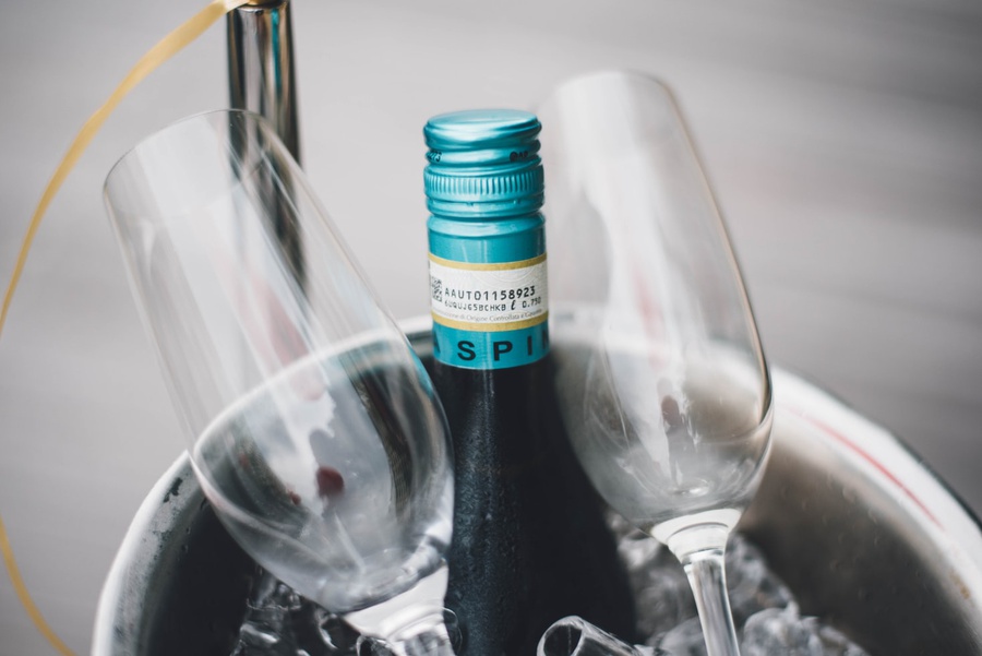
The primary choice is if your product is sparkling wine or rosé and must end up in a bucket without the label coming off after a few minutes.
The primary choice is if your product is sparkling wine or rosé and must end up in a bucket without the label coming off after a few minutes.
Sustainable Papers and Ecological Papers
In recent years, the issue of sustainability of wine labels have moved several paper mills to produce new ecological materials. There are, in fact, wine label papers that support the non-felling of trees. Paper is made with cellulose fibres from sugar cane and flax, hemp and cotton fibres. Materials that do not use cellulose have also been studied, such as stone paper, produced from waste dust from marble and stone processing.
Discover the recycled and sustainable papers of Materia Viva Fedrigoni!
Give a touch of sustainability to your projects.
Adhesives, Permanent and Removable
Permanent adhesives are generally chosen because they guarantee the perfect adhesion of the wine label to the glass of the bottle.
Sometimes it can be useful, however, to have labels that are removable, perhaps to recover the glass or for sustainability reasons. There are various types, one of the most used is an adhesive that once immersed in hot water tends to dissolve to allow you to easily remove the label.
Sometimes it can be useful, however, to have labels that are removable, perhaps to recover the glass or for sustainability reasons. There are various types, one of the most used is an adhesive that once immersed in hot water tends to dissolve to allow you to easily remove the label.
Would you like to know more? I leave you the complete article here
How do you choose the right paper for a wine label?
Wine label’s size
How often have you already thought about the design a wine label, and you don't know where to start defining the size? After all, designing a wine label is like creating a bespoke suit. In both cases, it is essential to determine the correct size. In this short tutorial, we will help you define the size of a wine label in 4 simple steps. Do not worry! It only takes a few simple steps to get the perfect size for your wine labels.
To accomplish this difficult task, you will need some essential tools:
- Flexible ruler
- Wine bottle to dress up
- Graph paper (or plain paper if you don't have the other)
- Pen or pencil
- Scissors to cut out the proof
- Wine bottle to dress up
- Graph paper (or plain paper if you don't have the other)
- Pen or pencil
- Scissors to cut out the proof
Let's find out what the four steps are:
- Measurement phase of the wine bottle. To design the perfect size for a wine bottle, you must first define the maximum size that the label can have depending on the shape of the bottle.
- Definition of the shape of the wine label. Once the overall dimensions of the wine label have been defined, it will be time to draw the die-cut trace of the label. The die-cut path determines the perimeter of the wine label on which the cut will be made during the production phase.
- Cut the wine label. This test allows you to make some changes to the size of the wine label to make it perfect.
- Measure the final size of the wine label. The last step is to measure the result. Spread the label on a flat surface and measure the base and height of the label.
Are you interested in the topic? You can find the complete article here
Typographic font and colour
Colour
The first thing to consider when deciding the colours to design a wine label is the colour of the bottle itself. Red wine is sold in very dark bottles, generally green or brown. To prevent oxidation caused by the sun's rays, it is, therefore, advisable to choose a label with a white or very light background, which will stand out more. As for the graphic elements, on the other hand, the colours will be chosen, paying particular attention to the target audience and the positioning of the product on the market.
To create labels that evoke the principles of organic and biodynamic agriculture principles, we suggest natural colours: green, which immediately recalls the idea of a "green product" and the whole colour range of browns and beiges reminiscent of the earth element. Instead, to maintain a more traditional style, the use of black and white is recommended, or soft colours, with some golden details. On the contrary, a young and innovative winery will dare with intense and vibrant colours and unprecedented combinations: from shocking pink to teal, from ocher to bright green, wide to imagination and creativity!
Font
Like colour, it must be in line with the brand and respond to the consumer's needs; an illegible font will hardly lead to a purchase. It is advisable to choose a couple of trio of fonts. For mandatory information, such as the product nature or the name and location of the bottler, the ideal is a condensed and legible font such as Calibri, Frutiger or Futura, regardless of the type of wine and company.
As for the font for the name of the wine and other texts on the label, we can repeat the same considerations we made for the colour: for a winery characterized by organic or biodynamic choices, the name of the wine could be represented with a calligraphic font, written by hand; for a more traditional line, a more elegant font, such as Zapfino, or a classic style, such as those found on classic Chianti or Barolo bottles, among which Bodoni or Traian will be more suitable.
Would you like to know more? Read the full article here
Features
Water resistant and waterproof
Water can be problematic when you design a wine label; whether you are dealing with humid conditions or have a product to put in the ice bucket, you will need to adopt a moisture-resistant label sticker. We recommend choosing a permanent adhesive that can only be removed with the help of solvents, rather than a removable label, excellent from the point of view of sustainability but much more sensitive to humidity.
Attention, however, it is necessary to make a distinction, as there are two types of cards:
Water Resistant. Papers are designed to resist accidental or light contact with water, used in humid environments or outdoors. They resist water penetration to a limited extent, thanks to a special treatment that reduces its absorption.
Waterproof. Papers are created with a unique plastic film between the front layer and the adhesive to remain cohesive and not change shape or texture when the label is exposed to humidity or immersion in water.
Are you interested in the topic? Discover the full article here
Removable
These labels, generally of coated paper, have a special glue that remains tough at temperatures below 25 degrees. This means that if the labelled wine bottle is placed in hot water above this temperature, the glue will tend to dissolve very quickly, thus ensuring the easy removal of a wine label. Another type for which hot water must not be used is that manually peelable labels, which have a specific adhesive that allows the label, raised from one of its ends, to be removed manually with discrete ease from an operator.
Discover the complete article on removable wine labels
Scratch-resistant
The type of material chosen will be of fundamental importance to determine the resistance of a wine label during transport and make it scratch-resistant. Paradoxically, porous, marked and uncoated papers allow the ink to penetrate more easily inside the material, making the label of wine more resistant to abrasion and scratching. On the other hand, smooth materials such as plastics (polypropylene) and metallized papers tend to accept and retain fewer inks.
However, the extra advice is to protect all these papers with a protective varnish, regardless of the type of support used. The paints can be opaque, glossy or neutral, and in this way, the material itself can be preserved. However, I recommend that you always be specific in indicating that the paint must resist scratching and remember that in the case of overprints, scratch-resistant colours tend to be not the best choice as they do not allow subsequent overprinting.
If the chosen support is a coated paper or polypropylene, it will be possible to plasticize the label of wine with another material such as adhesive polypropylene. In this way, it will be protected much more than by simple paint, both from bumps, scratches and even from some chemicals. The lamination of a wine label can be done glossy or opaque or soft-touch opaque to give an extra tactile effect.
Would you like to know more? Read the full article here
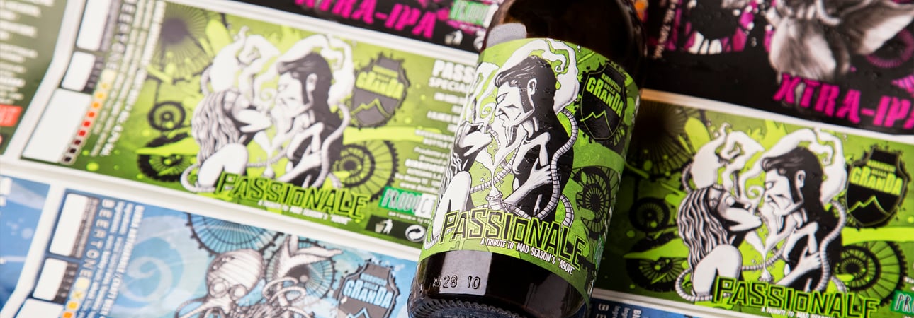
Ispirations
After the more technical part, we would like to inspire you with some inspiring design wine labels. Are you ready? Let's go.
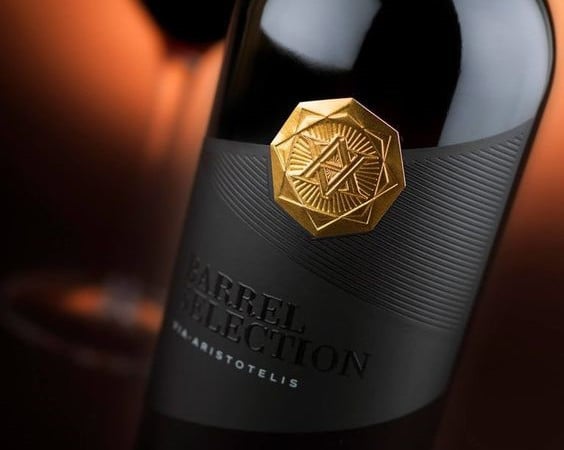
Via Aristotelis
This wine label inspiration is definitely impactful. The Barrel Selection of Via Aristotelis also features a black paste paper, with few elements with a very high added value. The element that stands out is the hot gold seal at the top, which was made with a foil and relief at the same time, obtainable with a brass punch with male-female relief. The central lines were probably made in debossing, i.e. by pressing on the paper with a cold punch to create the grooves, this effect can be accentuated by a transparent hot foil to give it a slight degree of shine. Via Aristotelis was printed in opaque white and Barrel Selection was emphasized by a glossy and thickened Braille screen printing.
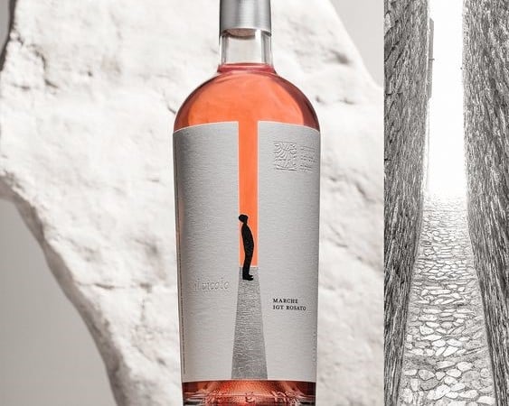
Il Vicolo
This label is a very interesting concept. As you can see from the image, the label represents a man with his gaze turned to the upper part of the typical Italian alleys, this one, in particular, is an alley that actually exists in the Marche which is considered the narrowest alley in the world.
The label is simple but has different complexities in terms of printing. The label is printed on very porous paper such as Cotton White by Fasson Avery / Cotton White by Fedrigoni-Ritrama. The central elements that create the empty space between the two walls of the alley have been removed. The road has been printed in silver foil with small micro-engravings that correspond to the cobbles of the passage. "Il Vicolo" and the logo at the top right were printed in debossing, that is, using a punch for the hot foil that was applied cold (or at a very low temperature of 35-40 degrees centigrade to soften the paper support).
The label is simple but has different complexities in terms of printing. The label is printed on very porous paper such as Cotton White by Fasson Avery / Cotton White by Fedrigoni-Ritrama. The central elements that create the empty space between the two walls of the alley have been removed. The road has been printed in silver foil with small micro-engravings that correspond to the cobbles of the passage. "Il Vicolo" and the logo at the top right were printed in debossing, that is, using a punch for the hot foil that was applied cold (or at a very low temperature of 35-40 degrees centigrade to soften the paper support).
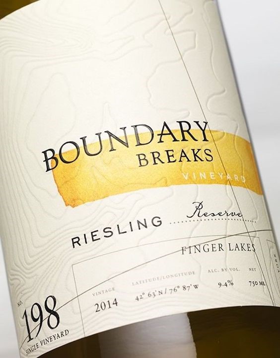
Boundary Breaks Wine
If there is an important detail to remember when designing a wine label, it is to leave room for paper; Boundary Breaks Vineyard is a label that features just this detail, and more.
The felt-marked natural paper is marked, creating topological areas, by a debossing that presses on the entire label. The simplicity of the colours (a black and a touch of yellow) creates calm and cleanliness. The thickened serigraphy in the register of the word Boundary Breaks crowns the whole and further embellishes the label.
The felt-marked natural paper is marked, creating topological areas, by a debossing that presses on the entire label. The simplicity of the colours (a black and a touch of yellow) creates calm and cleanliness. The thickened serigraphy in the register of the word Boundary Breaks crowns the whole and further embellishes the label.
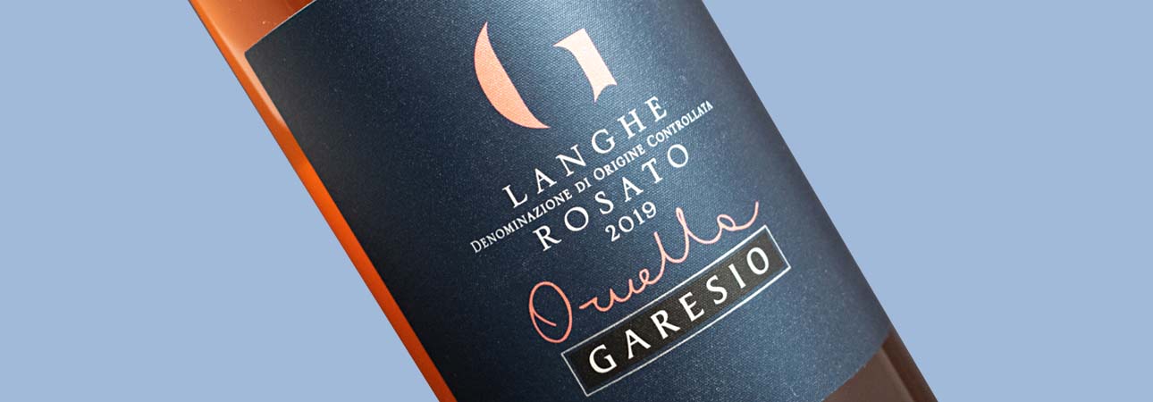
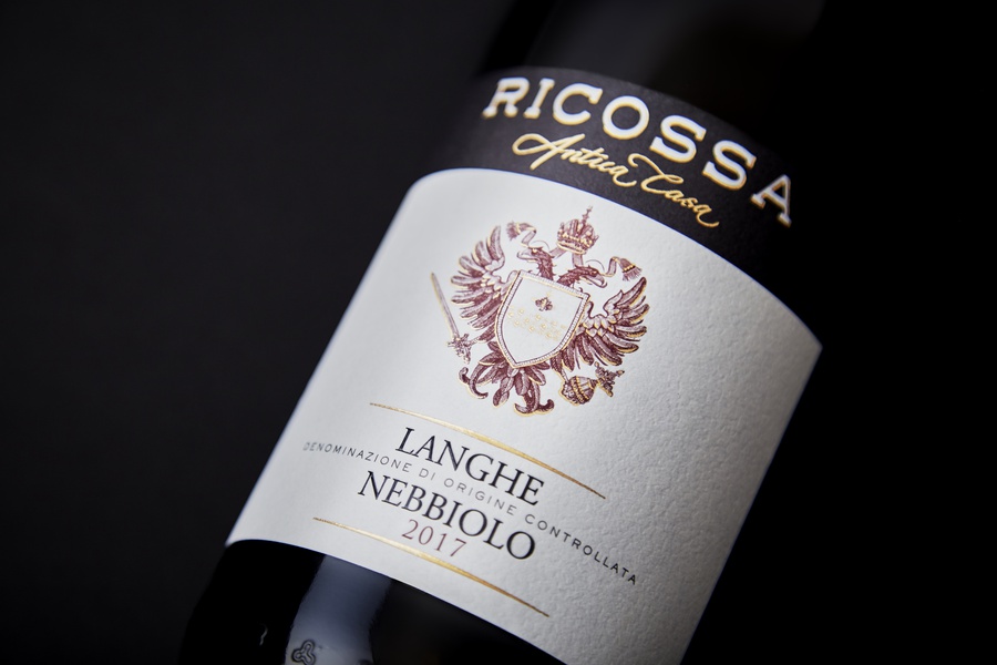
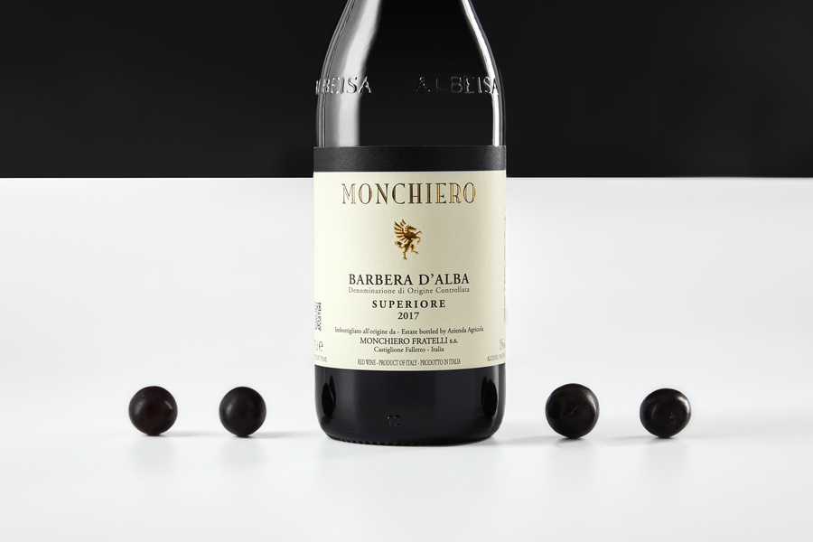
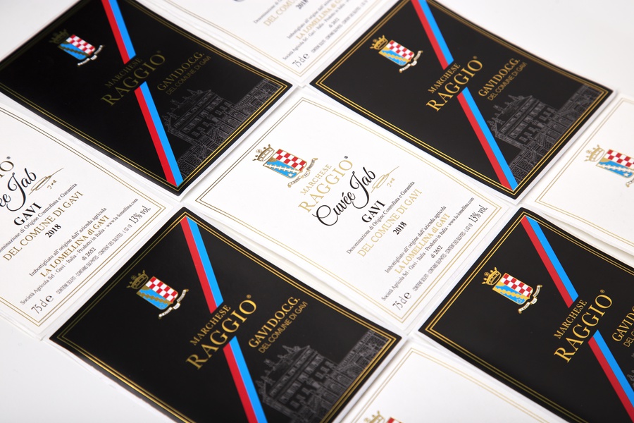
Do you need some inspiration
Here are some more examples!
I hope this complete guide to design a wine label has been helpful for you. If you need more information, we at Labelado can answer your questions and any press requests for all the processes you found in this article! And remember, if you need to touch the materials, you can always ask for a sample of our labels to select the most suitable material for your wine and your brand!
👍SUBSCRIBE to our Youtube channel and join the Labelado community to be constantly updated on the world of packaging!
Related post
Learn more
May 26, 2022
May 26, 2022

Dec 30, 2022

Feb 05, 2021