Did you like the article? Share it!
The spirits industry is one of the most creative sectors regarding packaging. Since the market is very competitive, brands tend to develop concepts that capture the consumer's attention through unique and innovative solutions!
Spirit bottle label design is just as important as the product. Today's consumers have a wide choice, and liquor and spirits brands constantly face an unrivalled level of competition. The correct label can differentiate your product from others to generate a great impression on your customer.
Distilleries need high-quality spirit bottle label design to win in such a competitive market. It is essential to have a label that communicates its character for an innovative product such as a spirit or a liqueur. Whether you want a vintage look or a minimalist design, the design and printing methods available today can suit almost any needs and design, and our team can offer you a wide selection of substrates and finishes.
Are you thinking of creating a custom spirit bottle label design? But don't you know how to make them unique? This is the guide for you! Today, we want to talk to you about how to characterize your spirits label, taking advantage of the graphics and the many processes and enhancements available to you.
Furthermore, we know that inspiration is often tricky to find; for this reason, we will conclude this guide by offering you some case studies of creative packaging for spirits, liqueurs and spirits made by us in collaboration with the designers.
Here are the various design steps that we will face:
- Choice of paper and colours
- Processing and finishing
- Case studies
- Our advice
Here we are! Are you ready? Let's begin.
# 01. Choice of paper and colours
The key to the choice of colours is undoubtedly in creating contrast. This is important to allow the essential elements of the label to stand out, leading consumers to focus their attention on information such as the name of the brand, the type of liqueur, the origin, etc. Furthermore, the choice of colours is closely linked to that of the paper; here, the possibilities are so many, but they can be grouped into three main types:
Coated paper. If you have opted for coated paper, you should know that it will allow you to obtain very bright colours, chosen absolutely from the Pantone Coated colour book, which includes the colours for coated papers. To know the difference between Pantone Coated and Uncoated, read our article here
Metallized paper. If the chosen paper is metallic instead, you can indulge yourself with various shades of yellow and orange, which will result in gold and copper, using the metallization of the support! Remember that this type of paper starts from a silver base and overlaps any colour. It will take on a metallic effect, allowing you to play with the graphics and the material.
Natural Paper This represents a more eco-sustainable choice, a highly recommended option in an era in which the consumer is attentive to the corporate vision of sustainability. In this case, we recommend that you give space to the texture of the paper by leaving it in its original colour or possibly by printing light beige or cream backgrounds to preserve the natural effect of the paper support.
# 02. Processing and finishing
How to make spirit bottle label design unique? We have already asked this question a little while ago, and now it's time to give you an answer: with the finishes. You know, the details make the difference, and this is also true, indeed above all, when it comes to printing. Processing and finishing allow characterizing the liqueur labels, giving them a premium aspect necessary to communicate the quality and character of a product of this type.
Let's see together among the enhancements offered by Labelado, which are the most suitable for spirit bottle label design. Remember, if you need printing suggestions, our team will be happy to help you find the right finish to produce a highly appealing label!
Hot foil
You know those metallic elements, which are found on numerous labels? It is hot foil, one of the noblest processes chosen. Hot foil is perfect for printing logos, titles and other elements to make them stand out.
The choice of hot foil colour is based on existing foils found in the foil suppliers' samples, such as the Luxor Alufin sample book from Kurz. From gold to silver, from copper to red foil, care must be taken to choose a suitable colour for your label and matches the graphics. You can select both glossy and opaque sheets, remembering that the glossy ones reflect the light much more; We do not recommend its use on elements such as texts because they could become illegible depending on the light.
Not sure which foil to choose? If you are interested, we can print a mockup - proof print - of your spirit bottle label design at very advantageous prices and without the cost of the punch (another factor to consider if you choose the foil as processing). This way, you will be able to see the simulated final result and avoid printing hundreds of liquor labels before making a final choice!
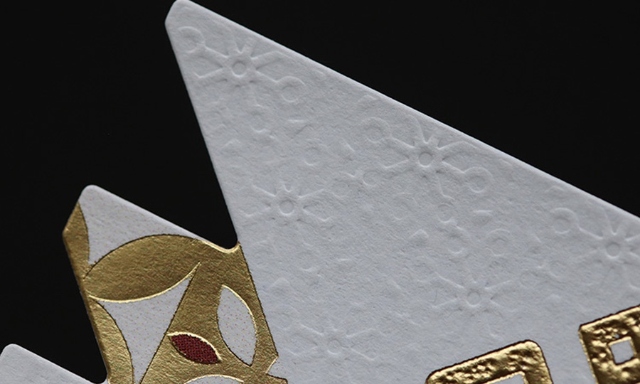
Dry relief
The dry embossing is an incredible element of ennobling, highly recommended to embellish your spirit bottle label design. This process is also done by using a punch; the only difference is that this system is composed of a "male" and a "female" who will press our embossed element onto the paper.
This type of processing allows you to obtain interesting results by making your labels and, with them, your product unique. It can be used to create textures on the paper if the relief is applied in non-printed areas, giving it a paper embossing effect. The dry embossing will make pleasant plays of shadows without printing other elements with ink.
It can also be combined with hot foil to obtain details. In addition to being metallized are also three-dimensional; combining your workmanship, you can get an even more elegant and premium-looking result.
Glossy Varnish Drip-Off
On the other hand, if you prefer to create contrasts, the best solution is to use selective paint. Thanks to her, you can create glossy-opaque effects that will give movement to your spirit bottle label design; for example, using a matte varnish on the bottom in contrast with a glossy one only on some selected elements.
This finish is ideal for embellishing your label; the only advice we would like to give you is to be careful not to print this paint "in negative", in the sense of highlighting light elements on dark backgrounds. A white detail painted on a black background will always be less visible than a glossy black element painted on a white background. Leave room for creativity and find the finishing that's right for you!
# 03. Case studies / Inspiration
We promised you, here are some case studies of creative packaging for spirits, liqueurs, and spirits in collaboration with distilleries and designers. Get comfortable and be inspired!
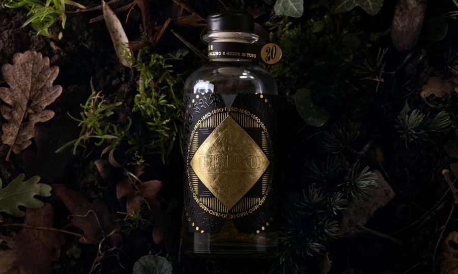
IRPO – Distilleria Antonellis
A more Italian spirit than this does not exist. Distilleria Antonellis is consistently recognized with innovative packaging in this sector, as demonstrated by their IRPO product.
In the Oscan language - a language used by the archaic populations of central Italy - IRPO means wolf. According to legend, the Irpini people chose this incredible animal to symbolize strength, empathy, and collaboration. This grappa packaging designed with extreme skill by Andrea Basile and Resistenza for Distilleria Antonellis combines creativity and territorial identity. What is striking is the preciousness of the packaging in all its components: from the label to the box to the choice of glass.
In the Oscan language - a language used by the archaic populations of central Italy - IRPO means wolf. According to legend, the Irpini people chose this incredible animal to symbolize strength, empathy, and collaboration. This grappa packaging designed with extreme skill by Andrea Basile and Resistenza for Distilleria Antonellis combines creativity and territorial identity. What is striking is the preciousness of the packaging in all its components: from the label to the box to the choice of glass.
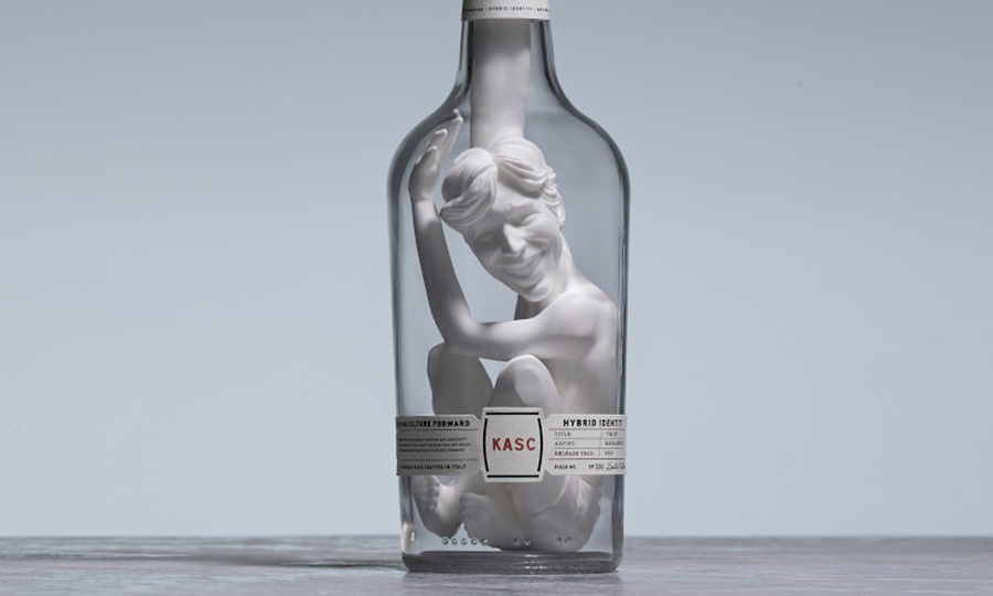
KASC – Kinahan’s Whiskey
A creative and artistic example of whiskey packaging is proposed by the Irish brand Kinahan's Whiskey. The limited-edition KASC ™ is, in fact, a pioneering project in which the bottle of whiskey becomes a real work of art. For this first release, KASC ™ has collaborated with MARCANTONIO, one of the most iconic contemporary artists on the Italian scene, creating a unique and provocative version entitled "I'm OK". This creative packaging for spirits features a special bottle in which a work of art has been set. Only a simple adhesive label and collar have been placed on it that emphasize the central element of the packaging, namely the sculpture.
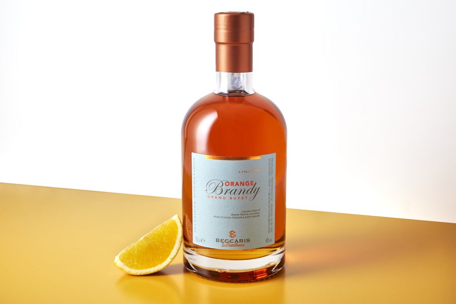
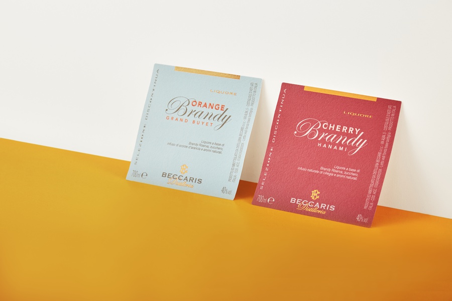
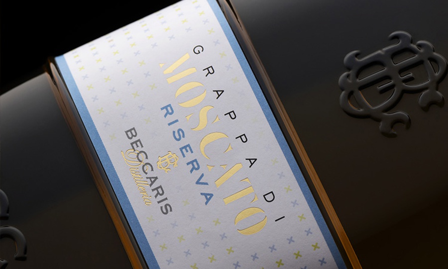
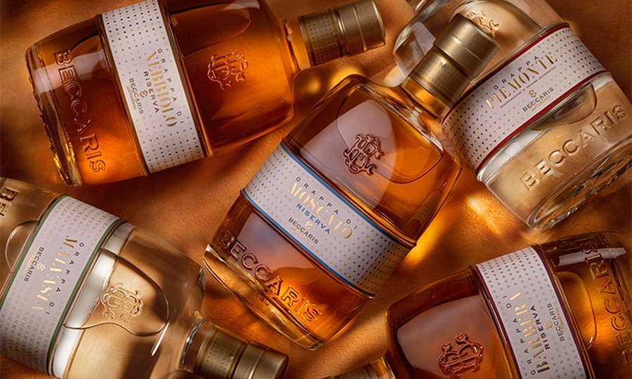
"La Botticella" - Distilleria Beccaris
This project saw us directly protagonists thanks to our young designer Carolina - the creative mind of the group and young entrepreneur - who led the first person this restyling and creation of labels for some bottles of the prestigious spirits of the Beccaris Distillery.
In this project, the product was dressed in every aspect, from the capsule to the label for the bottle. He tells us so "We started from the line of grappas, a prestigious line of the company, and then moved on to the more complex job: creating a line of liqueurs made up of 12 different products, from amaro to bitter, from gin to Genepy. It was an exciting but, at the same time, highly complex job.
" For this project, three labels were created for different bottles, from the most classic to the most modern. "The customer immediately liked the option of using symbols for each product and creating patterns with them. We then studied two colours for each product, in some cases contrasting colours, in others different shades of the same colour, from the brightest to the pastel colours. The chromatic choice was dictated by the type of product it represented. "
"La Botticella" is an excellent example of how the right mix of graphics, paper and finishes is the key to a successful label and to characterize the product. The most prestigious line of spirits was characterized by pastel shades, embossed paper, foil details and minimal patterns that represent the classic and refined mood of the fans. On the contrary, the line of liqueurs and bitters contrasts with the more classic one with its graphic style typical of Milanese cocktail bars, thanks to more complex patterns, glossy paper, intense colours and details in the gold paste.
Read the complete article about the project! La Botticella
# 04. Labelado's advice
For aged spirits. Use natural anti-pulp papers to help communicate the preciousness of the product and use a foil with warm tones (ducal gold or copper) to obtain metallic and luminous effects, or the silkscreen glossy varnish to enhance the name of your liqueur.
For young or bitter spirits Choose matte anti-pulp coated paper for excellent resistance to cold and dampness and give your label greater protection with matte lamination. The contrast between glossy and matte texture is very refined. Get it through glossy spot paint or silkscreen glossy paint.
This is just a taste of all the processes that can be done on your unique spirit bottle label design. In this article, we have shown you some examples of creative packaging for spirits. Remember that it is essential to start from your company's identity and find an element that allows your products to stand out originally.
The Labelado Team will be happy to help you give your distillate or liqueur the suitable charm. Furthermore, thanks to Labelado's high print quality, your graphics and your product will stand out from the competition, leaving the customer with only one choice: buy your distillate or liqueur! We at Labelado can help you turn any design into reality. Don't have a print-ready design yet? Don't worry; we can also help you in the design phase.
Related post
Learn more
May 26, 2022
May 26, 2022