Did you like the article? Share it!
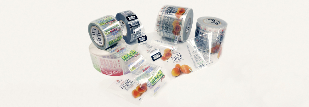
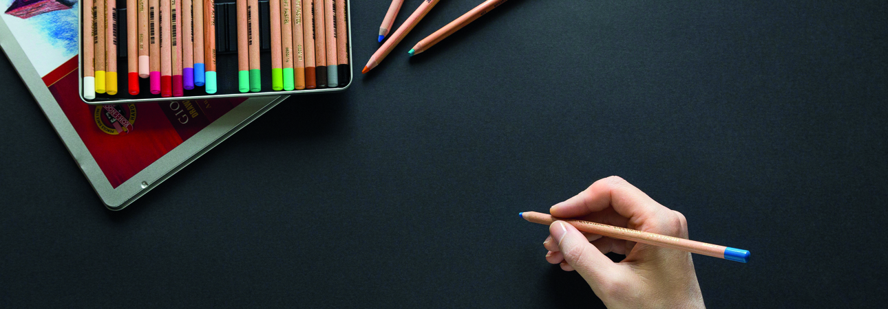
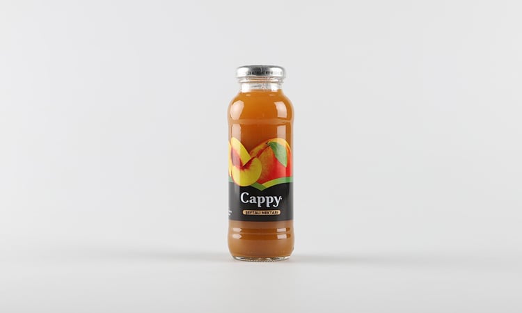
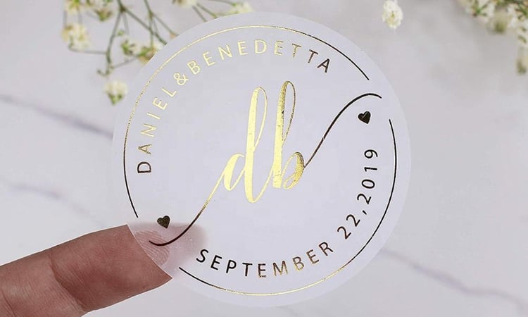
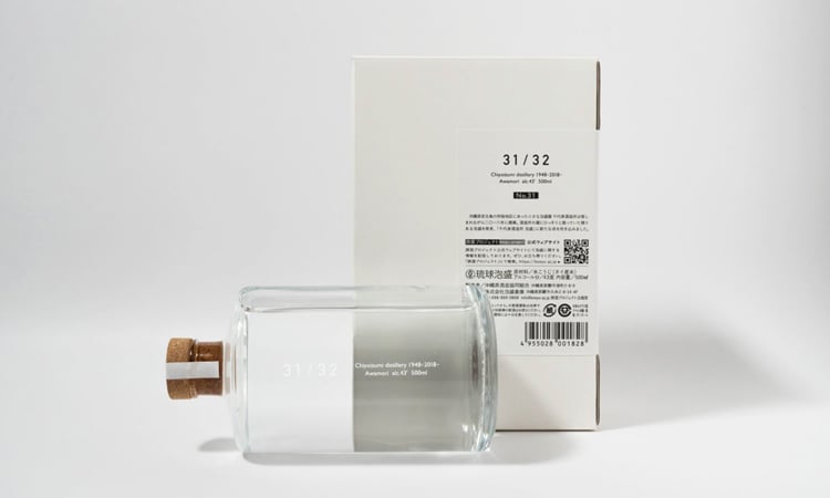
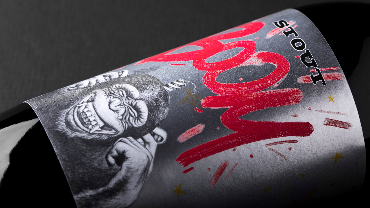
Label is there but you can’t see it: that’s how we could explain the “no label look”, one of the latest trends in the packaging world. This is indeed a peculiar effect that recalls the incision on glass or plastic – but obtained for cheaper and faster, that is with the application of a transparent label in polypropylene that perfectly match with the product thus hiding the outline and the layout while highlighting the printed part.
Thanks to their uniformity and clean aspect, transparent labels can add a touch of elegance while highlighting the graphic and textual elements of your label. If this technique seems to perfectly suit it, here are 5 tips to get an impeccable result!
1) Carefully evaluate your packaging design
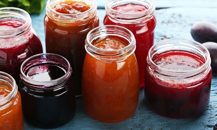
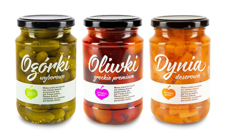
Before starting the creation of your transparent label, you should carefully examine the product packaging design. It would be indeed better to use this technique only on product with a really regular surface such as smooth glass or plastic. On the contrary, there may be unesthetic wrinkles that would make the label really visible – the opposite of our desired effect!
2) Choose the right colour for your labels graphic design
Creating a transparent label means that the background of your design will be those of your container or – in case it is transparent – those of the content. This make it necessary to pay particular attention to the colour choice, preferring colours in contrast with the background, so that your labels graphic design will be enhanced, and every part of the label will be perfectly readable.
3) Opt for an easy-to-read font
Since transparent labels do not guarantee a high contrast as it happens with traditional materials, we suggest opting for an easy-to-read font, especially for those informative elements that will be written in small size such as the nutrition facts ore the instructions for conservation.
4) Avoid manual application
Unless you are thinking about a really small batch, we recommend avoiding manual application in favour of a label machine. This will make the label perfectly adhere to your support and therefore will effectively match with the label or container.
5) Make your label truly unique
A transparent label is already a bold choice that will make your product stand out among the lot of offers on the shelves. For this reason, we suggest adopting other technique that can make your pack even more unique! If your product packaging as clear and light colours, you could opt for colourful graphic design. On the contrary, if the product is already colourful or dark coloured, you could go for a really minimal design thus making your product the real protagonist… Or you could add a special touch with a metallic ennoblement. As always, what matters is to choose solutions that will be able to immediately catch your potential customer’s attention.
Would you like to test the quality of transparent labels? Order now your Sample pack or send us your graphic design to request a sample print.
Related post
Learn more
May 24, 2022
May 25, 2022
Mar 02, 2023